|
|
177 |
|
|
|
|
important that they are quoted alongside the distribution from which they are derived.
There are a number of ways of representing sets of Z-values graphically. Probably the most obvious one is to use a scatter diagram, where the x-axis is scaled for Za and the y-axis for Zb and each plotted point is the pair (Za(Qi), Zb(Qi)). The number of points plotted will equal the number of queries. If we now draw a line at 45[[ring]] to the x-axis from the origin we will be able to see what proportion of the queries did better under condition a than under condition b. There are two disadvantages to this method of representation: the comparison is limited to two conditions, and it is difficult to get an idea of the extent to which two conditions differ.
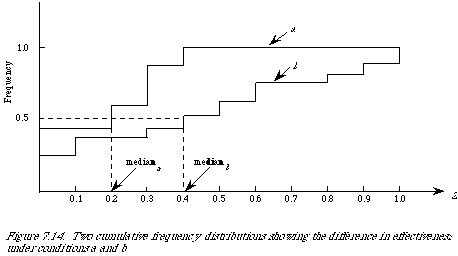
A more convenient way of showing retrieval results of this kind is to plot them as cumulative frequency distributions, or as they are frequently called by statisticians empirical distribution functions. Let {Z(Q1), Z(Q2), . . . , Z(Qn)} be a set of retrieval results then the empirical distribution function F(z) is a function of z which equals the proportion of Z(Qi)'s which are less than or equal to z. To plot this function we divide the range of z into intervals. If we assume that 0 <= z <= 1, then a convenient set of intervals is ten. The distributions will take the general shape as shown in Figure 7.14. When the measure Z is such that the smaller its value the more effective the retrieval, then the higher the curve the better. It is quite simple to read off the various quantiles. For example, to find the median we only need to find the z-value corresponding to 0.5 on the F(z) axis. In our diagrams they are 0.2 and 0.4 respectively for conditions a and b.
I have emphasised the measurement of effectiveness from the point of view of the user.
If we now wish to compare retrieval on different
|
|
|
177 |
|
|
|